

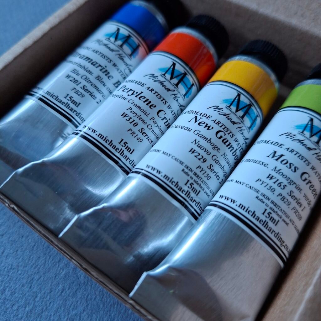
It’s Boxing Day and, having had a lovely day with family yesterday, I’m having a quiet time exploring some of my lovely arty presents. A particularly festive gift was the Michael Harding Christmas set of 4 watercolour paints, which I opened early so I could try them out in a sketching session at the Point of Ayre, on Christmas Eve. I’d never tried Michael Harding paints before but had heard how fine and wonderfully pigmented they are and they certainly didn’t disappoint! This set contains Ultramarine Blue, Perylene Crimson, New Gamboge and Moss Green, so this is a very useful set for mixing and a great introduction to this brand of watercolour paints.
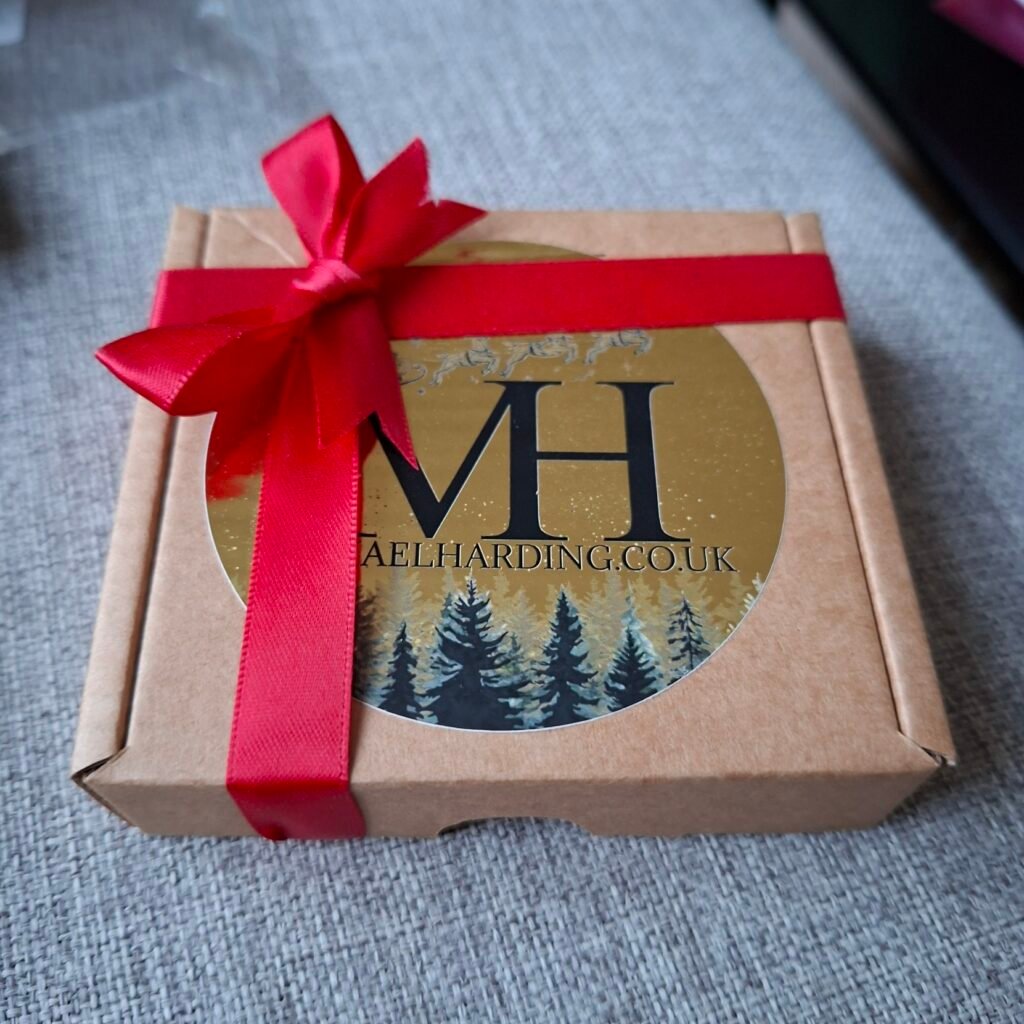
The Christmas set comes in this simple, but beautiful, packaging and the tubes are clearly marked with the colour name, pigment numbers and a coloured band that matches the paint colour quite well. The Michael Harding company is based in the UK and became renowned for high-quality oil paints before adding watercolours to their offering. It’s always nice to support British companies, especially when they are so focused on providing quality and ethically-sourced products. These aren’t vegan though, as they contain honey (a minute amount according to the Michael Harding website, to enhance flow and rewetting properties).
The first thing I do when I get new paints is to try out their mixes. I find it’s a really important step in getting to know them as colours and their properties such as how much they granulate and flow. I don’t do this with acrylic paints as they tend to be more predictable, plus you can hide any mistakes much more easily in acrylic. With watercolours you need to have a good idea how things will behave before you touch the paper with paint. I’ve learned this the hard way and am still, very much, on a learning curve!
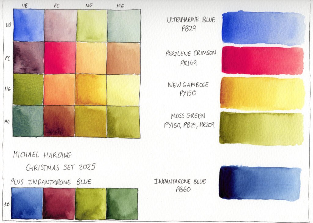
I was very glad I did this testing beforehand as these paints carry a really high pigment load. You need to be particularly careful with the Perylene Crimson as it tends to take over in mixes and is extremely vibrant when used alone. The Indanthrone Blue is quite sticky straight from the tube, so it’s hard to take only a little bit of paint, but that’s all that’s needed as it almost leaps off your brush and flies through the water in a wave of deepest blue. It’s both gorgeous and scary to use!
I filled some half pans with the paints and added them, along with a half pan of Schmincke Neutral Tint, to a little palette so I could take them out for a trial.
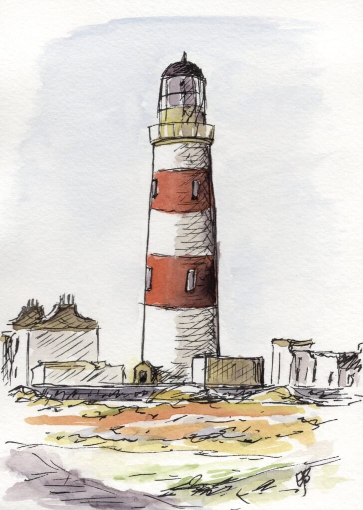
The above sketch of the lighthouse at the Point of Ayre was completed with the four colours from the Christmas set with the addition of Schmincke Neutral Tint (along with Platinum Carbon Black ink from my trusty Twsbi Eco fountain pen).
The four Michael Harding paints were an absolute pleasure to use and because I’d previously tested out the mixes, I knew I had to be extremely careful not to pick up too much paint. I also had the Neutral Tint on hand to quickly tone down the vibrancy of the paints when needed, particularly the Perylene Crimson.
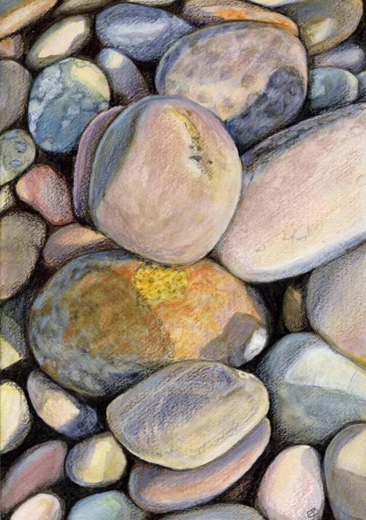
While at the Point of Ayre, I also took a few photos of the pebbles on the beach. One of the things I find fascinating about the pebbles and grass right next to them is the amount of different lichens that can be found living right there with them. One of the photos I took included a pebble covered with orange and yellow lichen so I thought this would be a good subject to test out my mixing of these colours, along with the many greys. I only used the four colours in the Christmas set for this watercolour underpainting as I felt to use the Neutral Tint would be cheating.
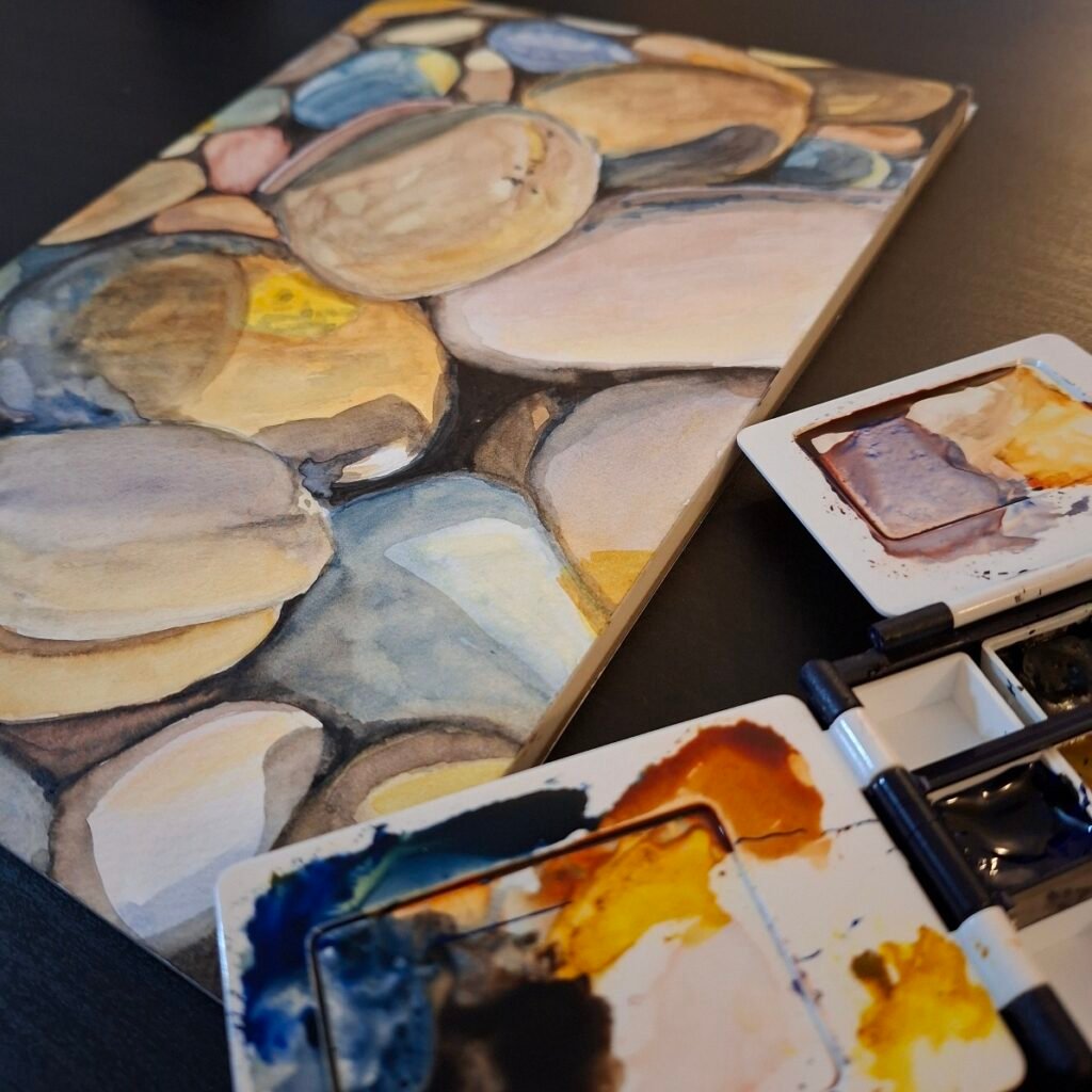
My watercolour skills have improved from doing a bad job while having no idea what I’m doing, to doing a bad job with some idea of how to go about things, which I guess is progress. As usual, I added a layer of Caran d’Ache Luminance pencil to add detail, texture and to sort out mistakes.
I didn’t spent a great deal of time on each stage as I was really just interested in exploring the qualities of the paints, getting a feel for the mixes and chilling out in front of the TV. This set gave a much warmer glow to the artwork than I’ve experienced with my watercolours before. This was mainly, I think, down to the PY150 in the New Gamboge and Moss Green. I love the effect and the richness of many of the deep blues, greens and burgandies that can be achieved with this set of colours.
I’d only heard good things about Michael Harding paints before trying them out and I’m very glad to say that they live up to my expectations. I’ll certainly be investing in more of these in the future when I see them on sale (Jackson’s Art carry them, as do Bromley’s, with individual tubes as well as tube sets being available). They have some interestingly-named earth colours which I’ll no doubt spend many hours researching on YouTube and a lapis lazuli that actually seems to rewet reasonably from a pan. Helen Cryer includes this paint in a swatching video of all her Michael Harding paints.
I hope you all had a lovely Christmas and wish you all a good New Year, with lots of creative opportunities. I’ll be spending the next week planning some upcoming projects and trying to work out where the whole of 2025 went!
See you in the New Year!
Emma
Leave a Reply to Emma Butler Cancel reply