
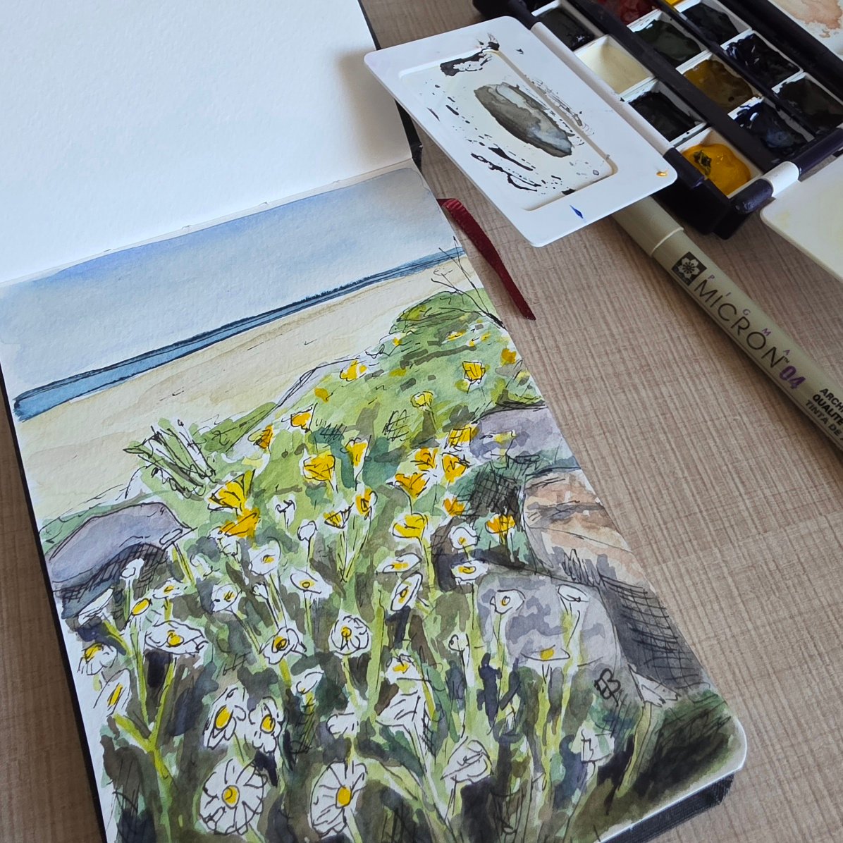
Recently, when choosing extra colours from the Michael Harding range of watercolours, I decided I liked the hue of yellow lake – a paint with the not so common pigment of PY180. I’d always associated ‘lake’ colours with rather fugitive pinks or reds so I was intrigued as to why this yellow, and supposedly lightfast, pigment had ‘lake’ as part of its name. A bit of research was in order – first to check out what type of pigment PY180 actually is, and then to work out why Michael Harding may have decided to add lake to its name. I also took the colour away with me on a recent trip to France and found it useful for its sunny, mid yellow colour and its ability to mix natural greens. Find out more about this interesting pigment in this week’s blog post.

Of course, the term ‘lake’ in lake pigments has nothing to do with bodies of water like lakes or ponds. I found that it’s generally said to come from the older word ‘lac’, which traces back through languages such as Hindi and Persian to refer to a resinous substance secreted by insects. Early European traders adopted the word ‘lac’ to describe these materials, and over time, the spelling and pronunciation shifted to ‘lake’ in English, even though the meaning had already begun to broaden.
Originally, ‘lake’ referred specifically to pigments made from natural dyes derived from organic sources like plants, insects or lichens. These dyes on their own are soluble in water and cannot be used directly as stable pigments in painting. To make them usable, artists and chemists developed a process in which the dye is precipitated onto an inert substrate, such as chalk or alumina. This process transforms a soluble dye into an insoluble pigment – what we now call a ‘lake pigment’.
The name ‘lake’ is therefore associated with a pigment that originated as a dye and had been chemically fixed onto a base. Historically, famous examples include carmine lake or crimson lake (from cochineal insects) and madder lake (from the madder plant). These pigments were prized for their rich, transparent colours, especially in fine art painting, where they were often used for glazing.
So what of the pigment in Michael Harding’s yellow lake? According to handprint.com PY180 is an azo pigment, meaning it’s a synthetic organic pigment formed using the process of diazotization, followed by azo-coupling. In the case of PY180, the pigment produced by these processes is raw and unstable so it’s converted into a stable, high-performance pigment through solvent-assisted crystallisation, which can apparently be thought of as a less traditional form of laking.
The azo pigments form the largest group of synthetic organic pigments and can be synthesised into a vast array of colours. In practice, they generally take yellow, orange and brown forms as there are better alternatives available for other colours, such as the phthalos compounds to form blues and greens.
It makes sense that Michael Harding chose to add the word ‘lake’ to the name of this paint as there is a type of laking process involved in the formation of the stable pigment. It’s a beautiful colour and I’m very glad Michael Harding added it to the range as I can’t find another range of watercolours that currently sells PY180 and artistspigments.org shows the Michael Harding paint as the only watercolour version.
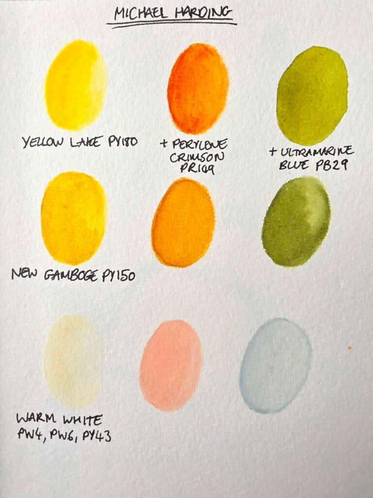
The colour from Werner’s Nomenclature of Colours that I think corresponds most closely to PY180 is ‘gamboge yellow’. Interestingly, I have a Michael Harding paint that’s called new gamboge but from the references given, I think this suits the slightly more orange ‘king’s yellow’ from Werner’s list.
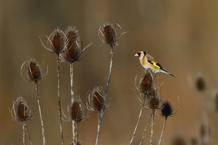
Werner gave the yellow on the wing of the goldfinch as a reference for gamboge yellow and from the photo and swatches below, I think this is a good match for Michael Harding’s yellow lake.
Yellow lake is a very handy colour to have in my palette and one that I’m likely to use both as a pure yellow and as a mixer. I like collecting different pigments, so the fact that this is an unusual one to find in watercolour ranges is an added bonus. I’m also glad to have found out the true meaning of ‘lake’ when it’s used to describe paints as it turns out my assumption that it’s a descriptor of a fugitive red or pink paint was way off (although sometimes lake pigments are both of these things). It always seems that there’s more to learn about watercolours!
Until next time,
Emma
Leave a Reply