I’ve become kind of obsessed with Port e Vullen since I first stumbled upon it earlier in the summer. Each time I visit this small beach, just outside of Ramsey, I’m amazed at the interesting geology and the variety of colours and textures of the place. On my most recent visit, which was unfortunately at high tide, I took as many photos as I could of the rocks and on my return home, generated colour palettes from them using an online tool. This is a first step in developing artwork based on the rocks here and I’ve chosen some of my favourite palettes to share in this week’s blog post.

In order to explore the variety of hues that could be found in the photos, I used the Coolors.co image picker. It’s quick and easy to use and as an online tool, doesn’t require any software to be downloaded to your computer.
To extract a palette from a picture, just upload the photo and the tool automatically picks five points from the photo as sources of colour for the palette. The colours are displayed on the left of the screen and the points they are taken from are shown as coloured circles on the photo. You can then slide the selector bar to see alternative colours or each circle on the photo can be dragged to a point of your choosing. I used this drag feature to make sure I captured key colours that only occurred in a very small area, but were really important elements of the photo.
When the palettes are generated, they’re shown with the Hex colour codes of each colour and there are many options for sharing or downloading the palette. I chose to download my swatches as pdf files so I could import them into Canva and combine them onto a page with the original photo.
For each photo I chose the palette that I liked best and either conveyed important elements from the photo or surprising colours that I wasn’t expecting to find. Although most of my photos were of the rocks, I took a couple of the sea as I was interested to see what colours lay there too.
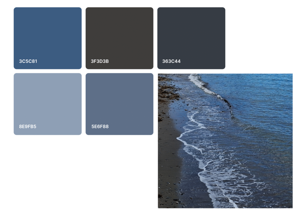
The above photo gave lovely shades of Payne’s Grey, along with a deep, neutral brown and a grey-blue. The Grey-Blue Luminance pencil matches this darker blue perfectly and isn’t a colour I would have thought of for the sea as it seems too dark, but clearly works on an overcast day.
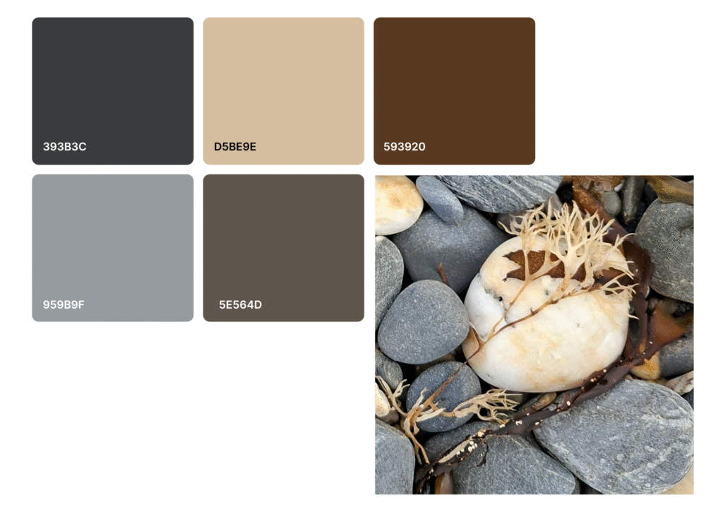
I loved the coffee and cream colours of this rock and seaweed and thought it would lead to a lovely palette. I wasn’t disappointed and I really want to develop this photo into an artwork. I adore rich brown colours and they work so well with the grey here.
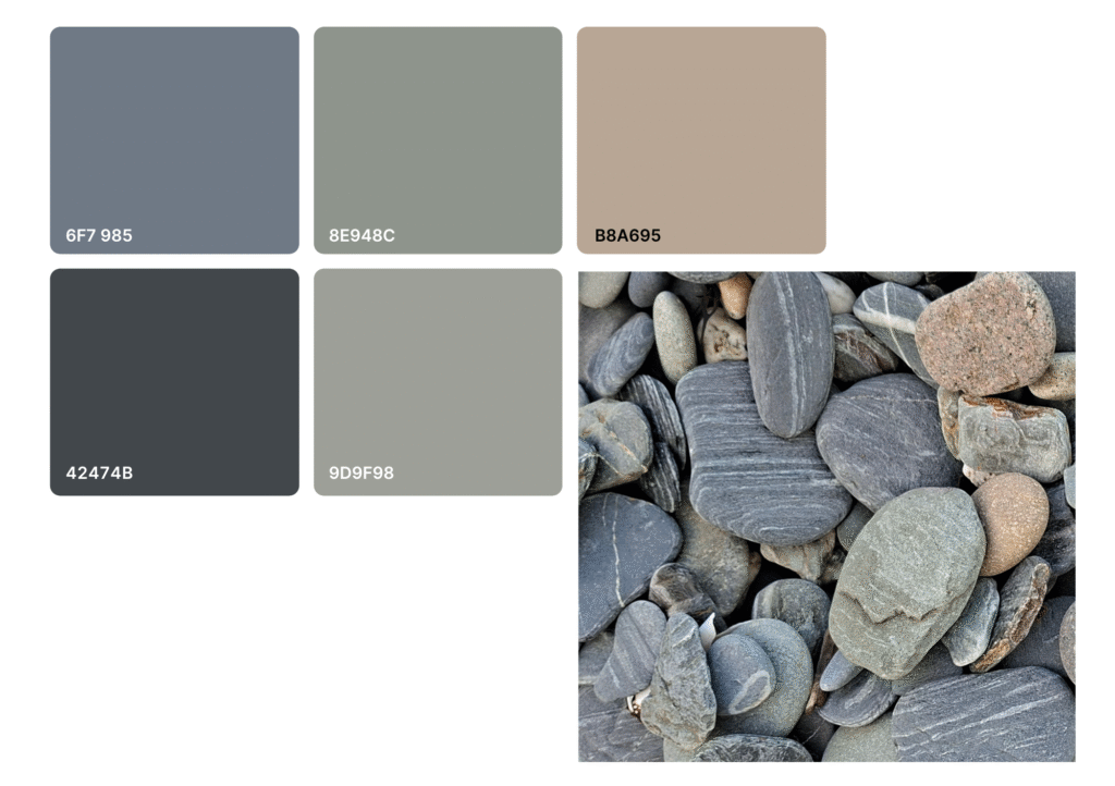
Oh my goodness! We’re so spoilt for beautiful pebbles on the Isle of Man! The muted palette created here is delicious and the striations on the pebbles add a lot of interest. This is another photo that I’ll enjoy developing further. I feel I need to use this palette in my house somewhere as well – I may need to upcycle some furniture!
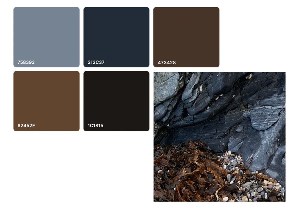
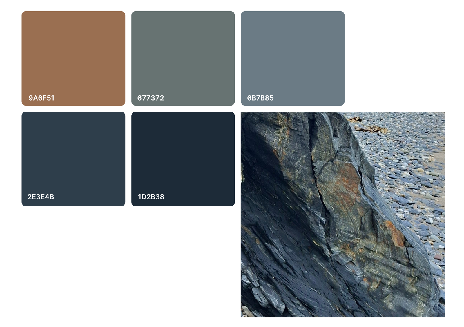
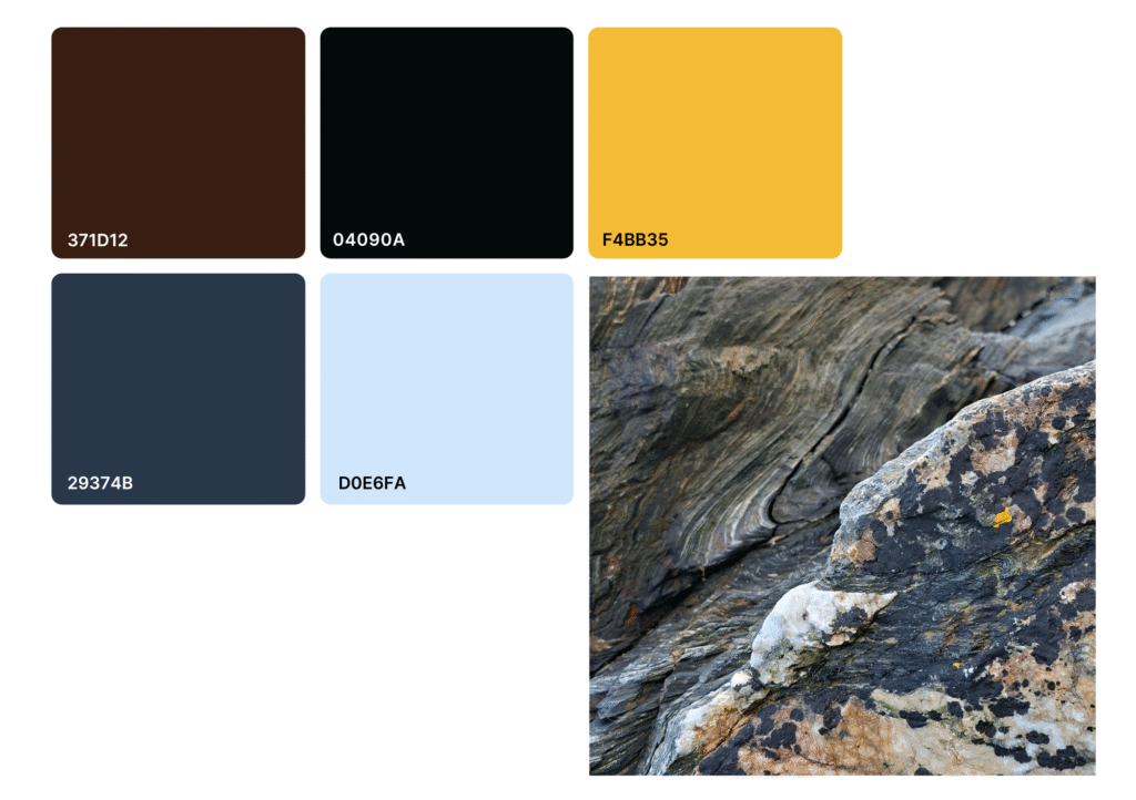
I think this is my favourite palette. I’m a complete sucker for a deep blue Payne’s Grey and from this exercise I now know the Hex code for it is 212C37. The rich browns work so well with the dark blue and the grey gives the palette a lovely balance. I’m going to be trying out some more abstract techniques soon and this photo and palette will definitely be a starting point!
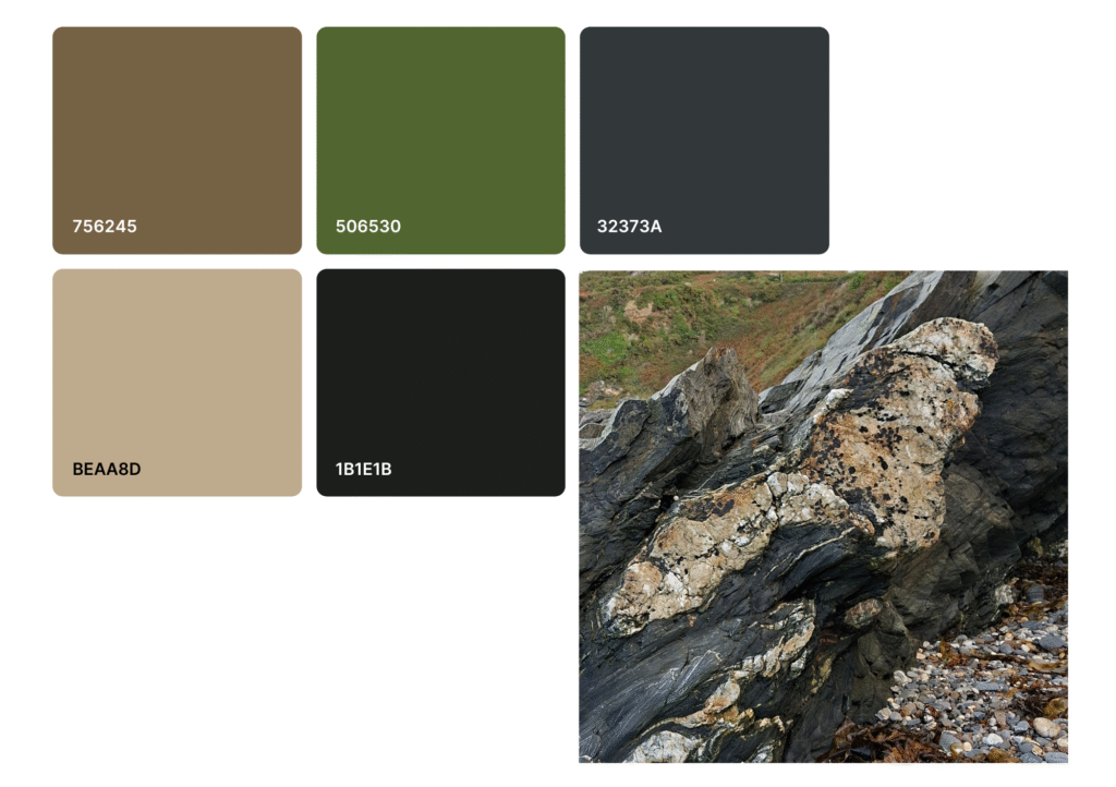
It wouldn’t be a true representation of Port e Vullen without reference to the surrounding coastline and at this time of year it’s full of muted greens and russets. The russet colours of the headland are reflected in the orange-browns of the quartz inclusions in this photo. It didn’t lead to my favourite palette, but the colours do represent the area well.
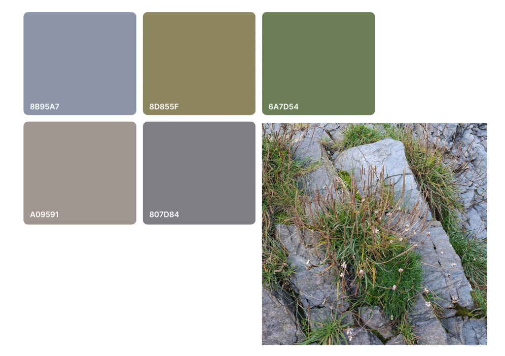
I really love violet-greys and was very happy to find such a colour in this photo, along with other beautifully muted colours. The blue-grey of the rocks works so well with the muted green and dusky pink that I may experiment with this triad further.
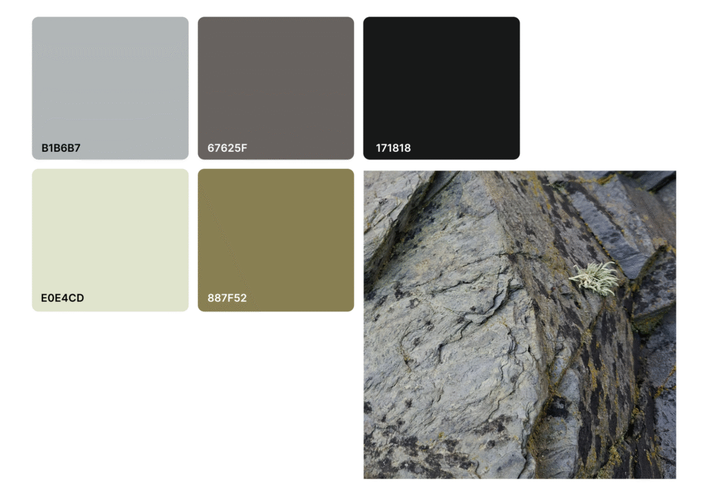
I love a lichen and this little, tufted fellow gave an interesting accent to the already beautiful rocks. I really like the range of colours here and although 887F52 is probably not on anyone’s list of favourite colours, it’s really needed to bring the palette together. It makes me think of my ‘Sunbird’ artwork as that’s full of bright and beautiful colours but it’s the olive-brown back of the bird that brings them together and makes the whole thing work. I can’t believe how many pencils I own in these ‘drab’ colours and how important they are to so many drawings. I really think children’s pencil sets should include more browns and muted colours!
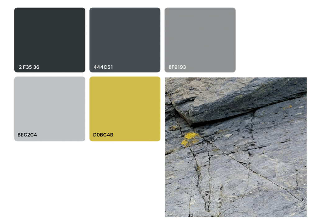
Above and below we have two more instances of lichen doing the heavy work when it comes to colour. In the instance above, the eye is drawn to the lichen because of its bright, contrasting colour and the way most of the lines in the rock seem to lead to it.
Below, the curves in the rock wrap back around towards the yellow lichen and its colour is emphasised by the deep blue-black of the darker lichen patches. The resulting palette is beautiful and is completed by the light blue of the quartz.
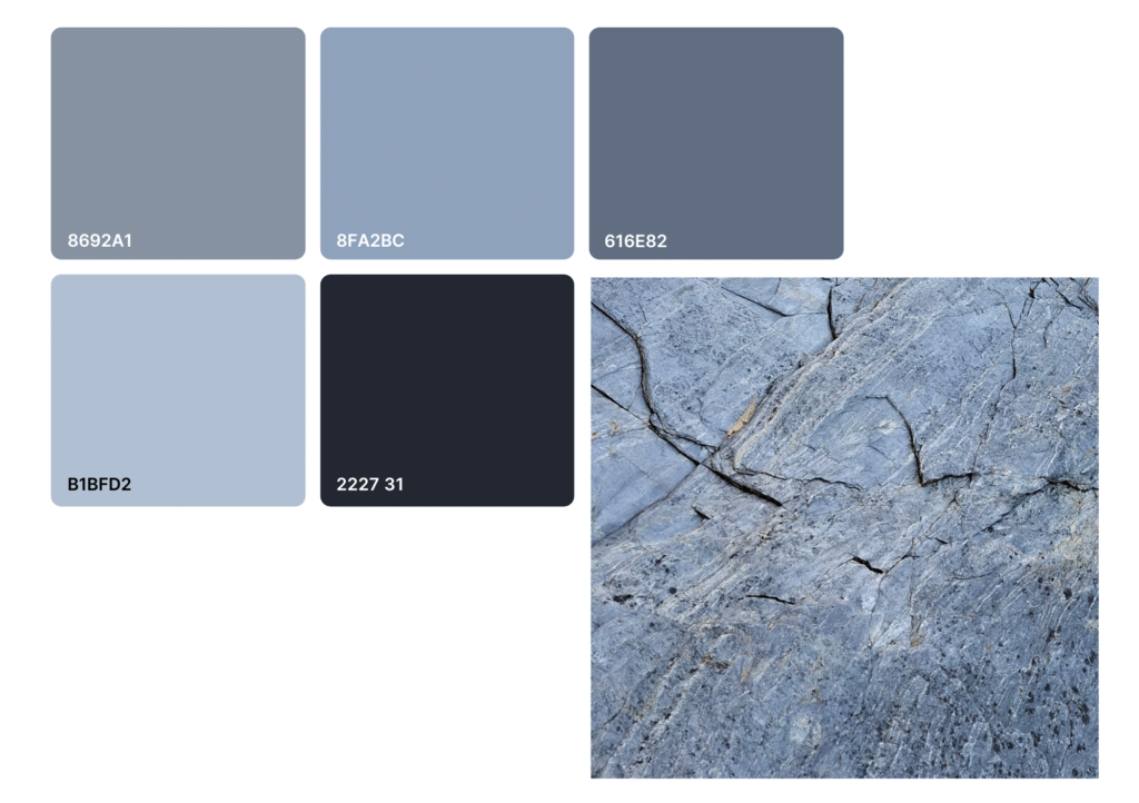
Although quite a plain rock face, the image below gave a lovely variety of cool greys. Colours that I usually associate with stormy skies and that I almost ran out of in 2024 (the year of perpetual rain on the Isle of Man) will be needed in abundance on Port e Vullen. Dark Indigo is one of my favourite luminance pencils to use instead of black so I was pleased to see it represented here in colour 222731.
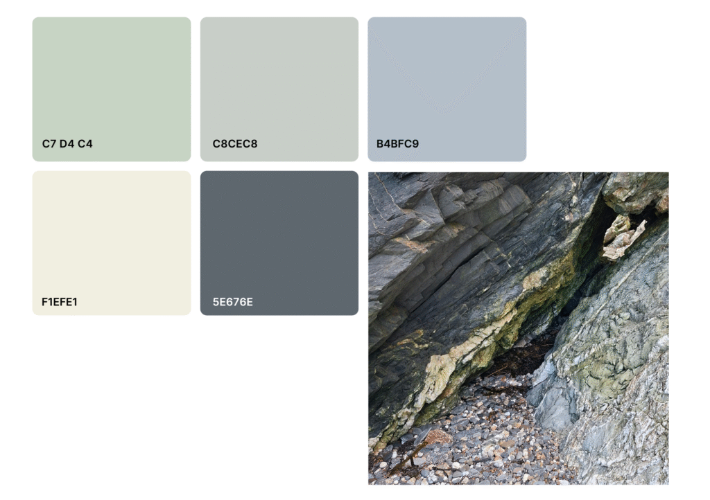
The last palette in the line-up was almost chosen as my favourite and was certainly the most surprising. The colours remind me of bird eggs and I wasn’t expecting to find them in the rocks on the beach.
This palette is like a pastel version of the colours from the pebble photo above. If the furniture of my house is going to be coloured with the pebble palette, then the walls and curtains will have to be coloured with these. Perhaps I should just go and live on the beach and save myself the work!
I hope you enjoyed my colour journey around Port e Vullen. Finding new ways of observing the world is always a worthwhile venture and gives new perspectives and insights that are so valuable as an artist. I also love the way colours in nature work so well together. Ralph Waldo Emerson said “Nature always wears the colour of the spirit,” suggesting that colours in nature are harmonious and reflect a deeper truth – I can certainly believe that in a place like Port e Vullen.
Next time I’ll share some of the artwork I’m developing from this exercise.
Have a good fortnight!
Emma
Leave a Reply