
Back in my Swatching for Spring blog post, I swatched every colour from my watercolour paints. It gave me a clear idea of how my paints behave and a quick reference to the colours I own. It also set the groundwork for this next step in my mixed media exploration.
Today, I’m excited to share the results of a project I’ve had on my mind for a while: matching my coloured pencils Caran d’Ache Luminance to my watercolours. I’ve also recently bought a few of the Derwent Lightfast pencils to fill in some gaps in the Luminance colour range, so I thought I’d add these in as well!
The Process
I swatched all my Caran d’Ache Luminance and Derwent Lightfast pencils, (plus the Chinese White from the Derwent Drawing pencil as I use this a lot) and compared them visually to the swatches from my watercolour library. It was interesting how some of the names of the colours helped this matching process and some didn’t. It required me to ignore the description of the colour and just concentrate on the visual characteristics rather than my preconceptions from the name. It’s amazing how your brain can get in the way sometimes.
Below, you can see the results, organised by colour family.
(CDL = Caran d’Ache Luminance and DL = Derwent Lightfast)
Green Blues
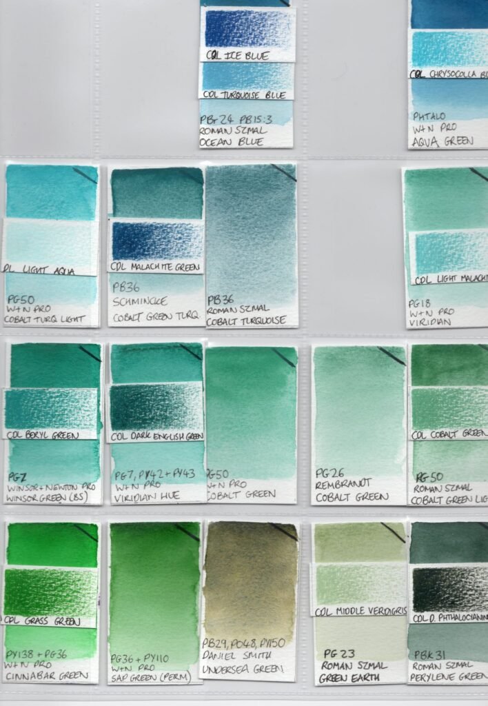
Notes:
- CDL Ice Blue and Turquoise Blue both matched Ocean Blue (Roman Szmal – PBr24, PB15:3)
- DL Light Aqua was an almost perfect partner for the more dilute mix of Cobalt Turquoise Light (W&N Pro – PG50)
- CDL Malachite Green matched Cobalt Green Turquoise (Schmincke – PB36) although this doesn’t show well on the scanned image above.
- CDL Chrysocolla Blue paired well with Aqua Green (W&N Pro – Phthalo) but again this didn’t show too well on the above image.
- I loved the way the CDL Cobalt Green matched the Cobalt Green Light (Roman Szmal – PG50) as this is one of my favourite shades of green.
Pink Blues
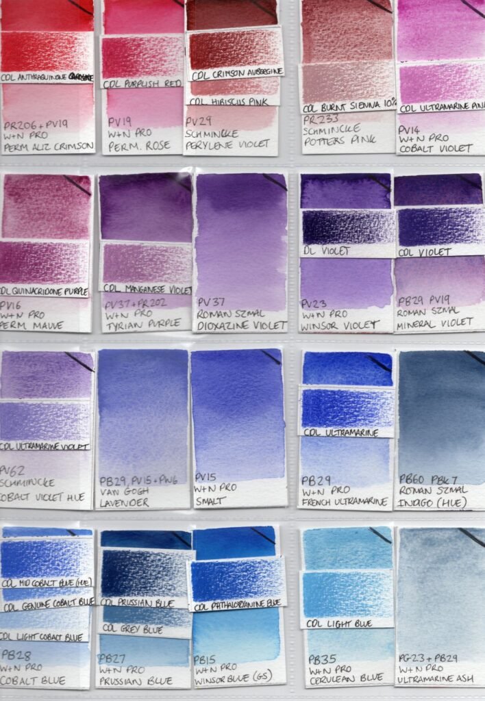
Notes:
- CDL Burnt Sienna 10% matched Potter’s Pink (Roman Szmal – PR233)
- CDL Anthraquinone Carmine matched well with the deeper shades of Permanent Alizarin Crimson (W&N Pro – PR206, PV19)
- DL Violet and CDL Violet matched the darkest shades of the Winsor Violet (W&N Pro – PV23) and Mineral Violet (Roman Szmal – PB29, PV19).
- The quite different CDL Prussian Blue and CDL Grey Blue matched different dilutions of the Prussian Blue (W&N Pro – PB27)
- CDL Light Blue paired nicely with Cerulean Blue (W&N Pro – PB35) which is perhaps unsurprising as I use both of these for skies.
Red Yellows
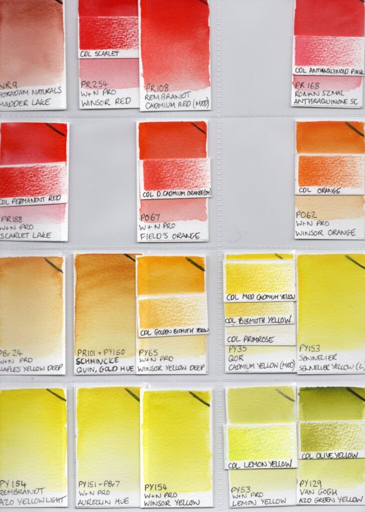
Notes:
- CDL Scarlet complemented Winsor Red (W&N Pro – PR254)
- CDL Anthraquinoid Pink matched the lighter shades of Anthraquinone Scarlet (Roman Szmal – PR168)
- CDL Golden Bismuth Yellow was nearly identical to Winsor Yellow Deep (W&N Pro – PY65) and as this is one of my favourite yellows in the Luminance Pencils, I think this connection will prompt me to use Winsor Yellow Deep a bit more as it often gets overlooked.
- I like the CDL Olive Yellow more now I can see how closely it matches the gorgeous Azo Green Yellow (Van Gogh – PY129).
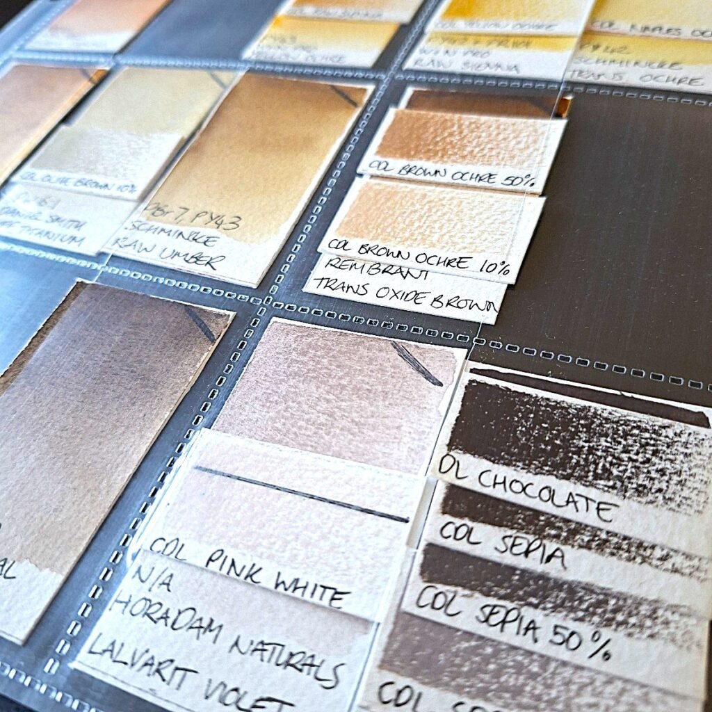
Neutral Browns
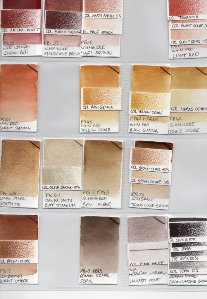
Notes:
- CDL Brown Ochre 50% and Brown Ochre 10% matched different dilutions of Transparent Oxide Brown (Rembrandt – PR101) but the CDL Brown Ochre pencil matched the Burnt Umber (Rembrandt – PBr7)
- CDL Yellow Ochre matched Raw Sienna (W&N Pro – PR101, PY42) whereas CDL Raw Sienna matched Yellow Ochre (W&N Pro – PY43)
- Unfortunately I had no direct match for the Sepia (Roman Szmal – PBr7, PBk9) and will try to find a pencil that matches from my other pencil ranges. I love this colour and am always buying brown pencils, so I must have something!
- DL Chocolate and the CDL Sepia pencils found a close match in the difficult to use (due to very heavy pigment particles) Iron Chrome Brown (Roman Szmal – PBr29)
Grey Blacks
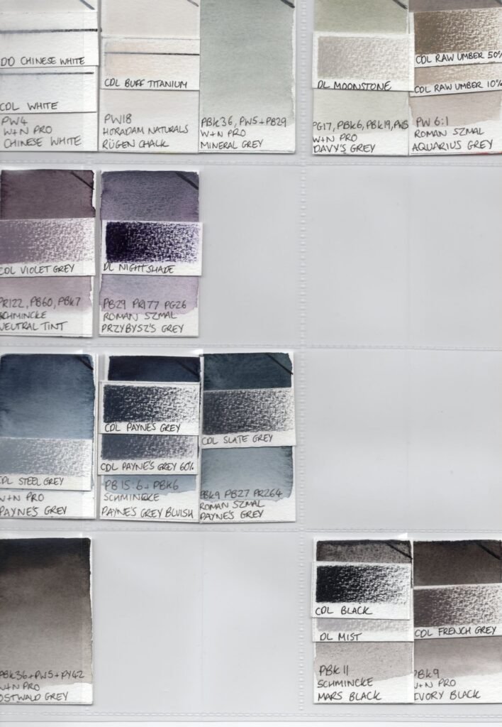
Notes:
- CDL Violet Grey matched Neutral Tint (Schmincke – PR122, PB60, PBk7) which just goes to show how purple the Schmincke neutral tint is.
- I’d never thought of Rugen Chalk (Horadam Naturals – PW18) as a buff titanium colour before, but this process showed a close match to CDL Buff Titanium.
- CDL Payne’s Grey and Payne’s Grey 60% matched Payne’s Grey Bluish (Schmincke – PBk6, PB15:6) but the CDL Payne’s Grey 30% didn’t, which was a surprise
- DL Moonstone matched Davy’s Grey (W&N Pro – PG17, PBk6, PBk19, PW5) which was another surprise
- DL Mist and CDL Black paired with different dilutions of Mars Black (W&N Pro – PBk11)
- CDL French Grey was a much closer match to Ivory Black (W&N Pro – PBk9) than I would have ever anticipated!
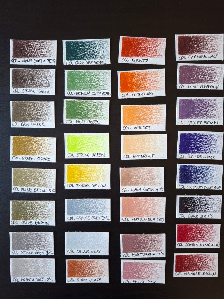
No Match (Yet!)
There were a few pencils that stood apart — either too unique or subtle to find a direct match among my watercolours. These “No Match” colours may still find their way into compositions, but they’ll stand as accents rather than blend-ins.
Leave a Reply to Emma Butler Cancel reply