
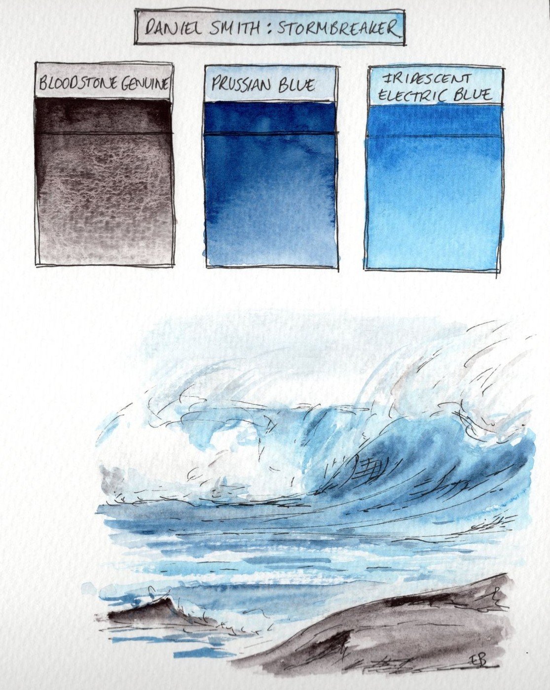
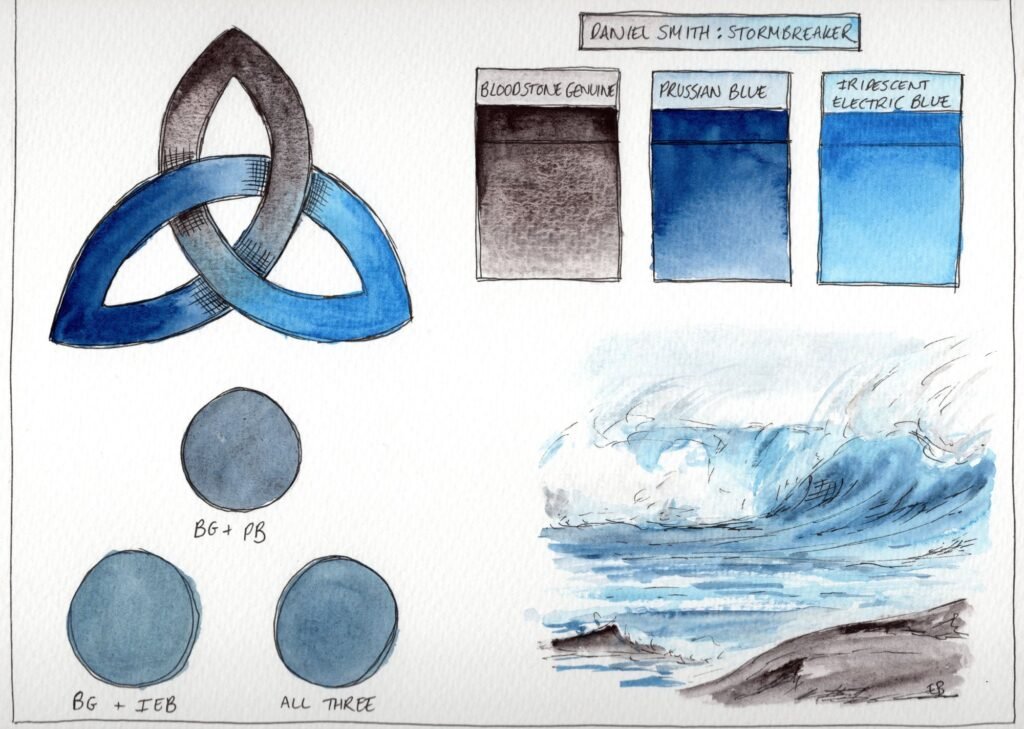
In the week that brought Storm Bram to the Isle of Man, it seems fitting that I review my recently purchased Stormbreaker Triad set of Daniel Smith paints. The set is designed to help artists ‘command the drama of the elements’ and is perfect for ‘wild seas and turbulent skies’ according to the Daniel Smith website. Containing an interesting mix of the highly granulating Bloodstone Genuine, the powerful Prussian Blue and the shimmer of Iridescent Electric Blue, this is not a typical triad of paints.

I was most attracted to the Stormbreaker Triad set by the gorgeous granulation of Bloodstone Genuine but was also intrigued as to how the iridescent colour would work in combination with the other paints. When creating the swatch sheet I was very happy with how the colours work together and found they do, indeed, create the colour of stormy skies. As each of the colours in this set has an element of particular interest I’ll consider each below:
Prussian Blue (PB27)
I’ve always been a fan of Prussian Blue in sketches and have used the Winsor and Newton version for years. Prussian blue is considered the first modern synthetic pigment, but it has held a reputation for instability almost since its invention in the early eighteenth century. Artists quickly noticed that the colour had a tendency to fade, particularly when it was mixed with white pigments or cheap fillers. This sensitivity is largely down to how it was originally made – early recipes using animal blood created a by-product called hydrated alumina, resulting in translucent, flake-like particles that are far more prone to fading than the dense clumps produced today. When mixed with white lead, the light bounces around inside the paint layer more intensely, speeding up the damage. As it degrades, the pigment doesn’t just vanish – it undergoes a shift in colour, losing its vibrancy to become lighter, less blue, and eventually turning into a dull, yellowish-grey.
The truly strange thing about Prussian blue is that this fading can be a reversible magic trick. Through a chemical process called a reduction-oxidation (redox) reaction, light can actually ‘reduce’ the blue pigment into a colourless substance known as Berlin white. In the right conditions, like the thin washes of a cyanotype, putting the image in the dark allows the oxygen in the air to turn that white back into blue. However, for oil painters, although some slight recovery is possible, the fading in oil paints typically becomes permanent. This happens because the pigment eventually stops switching back and forth and instead breaks down completely into oxidation products like ‘Prussian yellow’. There’s a very detailed description of the fading and colour changes of Prussian Blue in a National Gallery Technical Bulletin (Kirby, J. and Saunders, D. (2004) ‘Fading and Colour Change of Prussian Blue: Methods of Manufacture and the Influence of Extenders’, National Gallery Technical Bulletin, 25, pp. 73–99) if you’d like to know more about the colour changes of this pigment.
Bloodstone Genuine (Genuine Bloodstone)
Bloodstone is a dark green variety of chalcedony, a type of microcrystalline quartz, distinguished by the red or reddish-brown spots scattered across its surface. These spots are caused by iron oxide and resemble drops of blood, which is how the stone was named. It is also known as heliotrope from the Ancient Greek words for ‘sun’ and ‘to turn’.
Bloodstone has also been associated with symbolism and folklore. In many traditions, it was believed to possess protective and healing properties, especially related to strength, courage and vitality. This seems fitting for a paint in the Stormbreaker triad.
I’m not sure if Bloodstone Genuine is made from the red iron oxide inclusions of the bloodstone mineral rather than the surrounding green crystal, but this paint is very similar to Daniel Smith’s Hematite Genuine. Bloodstone Genuine is a slightly warmer colour though and I love it! I looks brown, black and violet to me but in a way that’s hard to pin down. It’ll be such a wonderful colour to have if painting bark or stone. Bloodstone Genuine produces a useful blue-grey with the Prussian Blue and contrasts beautifully with the Iridescent Electric Blue. I would never have put these colours together in a set, but whoever did knew what they were doing! Dr Oto Kano has a really useful video showing the properties of this paint and comparing it to Hematite Genuine on her YouTube channel.
Iridescent Electric Blue (PW20, PW6)
Iridescent Electric Blue is a surprising colour in that it’s very distinctly blue, but contains two white pigments. The PW20 is mica and, according to the Daniel Smith website, it’s been coated with highly reflective metal oxides. I’m not sure whether it’s the metal oxides that create the blue colour alone or whether a blue pigment has also been added (it wouldn’t be the first time Daniel Smith haven’t declared all the pigments that make up a paint) but whatever the cause, the colour is really beautiful and the mica particles have been ground finely enough so that it doesn’t look like a cheap sparkly paint.
Once dry, the paint looks like a non-iridescent paint until the paper tilts, the light catches it, and it lights up in a way that could well be described as ‘electric’. Daniel Smith’s website refers to the way a similar effect can be seen in such things as peacock tails and I have written a blog post about how nature often creates the impression of blue from the structure of feathers, using kingfishers as an example. I’m not sure where I’ll use this paint as it could seem a little gimmicky, but I’ll play with it in sketches and try it out in a couple of bird mixed media pieces.
Daniel Smith have certainly come up with a clever marketing idea with these triad sets and they’ve caused me to end up with paints that I probably wouldn’t have selected individually. I’m very glad to have all of the colours from both this and the Desert Horizons set that I reviewed a few weeks ago, so I may well give some of the other sets a go. They’re currently on offer at Bromley’s Art Supplies, along with the rest of the Daniel Smith range. I’m currently really loving the Daniel Smith watercolour sticks as well, so it’s a dangerous game venturing onto any website with Daniel Smith offers at the moment!
My next blog post will be on Boxing Day, so have a wonderful Christmas if you celebrate it!
Emma
Leave a Reply