
The Island’s brambles are in full bloom at the moment and some are starting to develop the first signs of berries. Blackberry bushes are a difficult and often unsightly plant when they take hold in the garden and yet their flowers are such a beautiful sight when seen in the hedges. The delicate colours of the blossom contrast starkly with the prickly, tough stems and I decided to use online tools, to see if I could develop a pleasing palette based on a photo of some bramble blossom from a Ramsey hedge. In this week’s post, I’ll take a look at a few of these online tools for palette creation and describe how I made an interesting discovery about the colour of bramble blossom.

Online colour palette generators are a game-changer for designers and artists alike. These innovative tools allow users to simply upload any photo and instantly generate a colour palette based on the image’s hues and tones. This process involves sophisticated algorithms that identify and extract the most prominent and complementary colours, creating a palette that perfectly reflects the image’s look.
There are several free online colour palette generator tools available to use within your browser. I’ve tried out a few and found that although they have the same basic function of identifying the main colours in a photo, they often differ in the way these are presented and in the number of additional features beyond colour picking and palette creation.
Canva has a very basic colour palette generator that can extract the main colours from an uploaded photo and present them as a palette. The Hex colour codes and colour names are also given. Although this palette generator is basic in itself, Canva is a sophisticated but easy to use graphic design and publishing software, which allows you to apply the generated colour palette to your projects. I use Canva regularly, and find it very helpful to be able to easily pull colours from photos when designing graphics for social media and other projects.

Other colour palette generators can take a single colour from a photo, and use it as a starting point for colour palette suggestions. One such online tool is ImageColorPicker.com, which allows you to choose a colour from the photo and then view the different shades and tints of that hue as well as a variety of colour palettes based upon it. Some of the generated palettes are more successful than others, but it’s a good way to get palette inspiration and play around with colour from photos.


The online tool that I used to develop my colour palette from the bramble photo is also called Image Color Picker, but this one is from AppyPie Design. I wanted a colour palette generator that would give me the CYMK reference code as I wanted to check colours against the ones referred to in Nature’s Palette. ImageColorPicker gives the Hex, CYMK, RGB and HSL colour codes as the cursor is moved over the photo. It also tells you the dominant colour in the whole photo and a colour palette based on it.


I moved my cursor over the photo and selected as many colours as I could that were close to the ones listed in Nature’s Palette, as I was then able to use the Caran d’Ache Luminance pencil that corresponded with that colour (as that’s also given in Nature’s Palette). Here are the colours I ended up with:

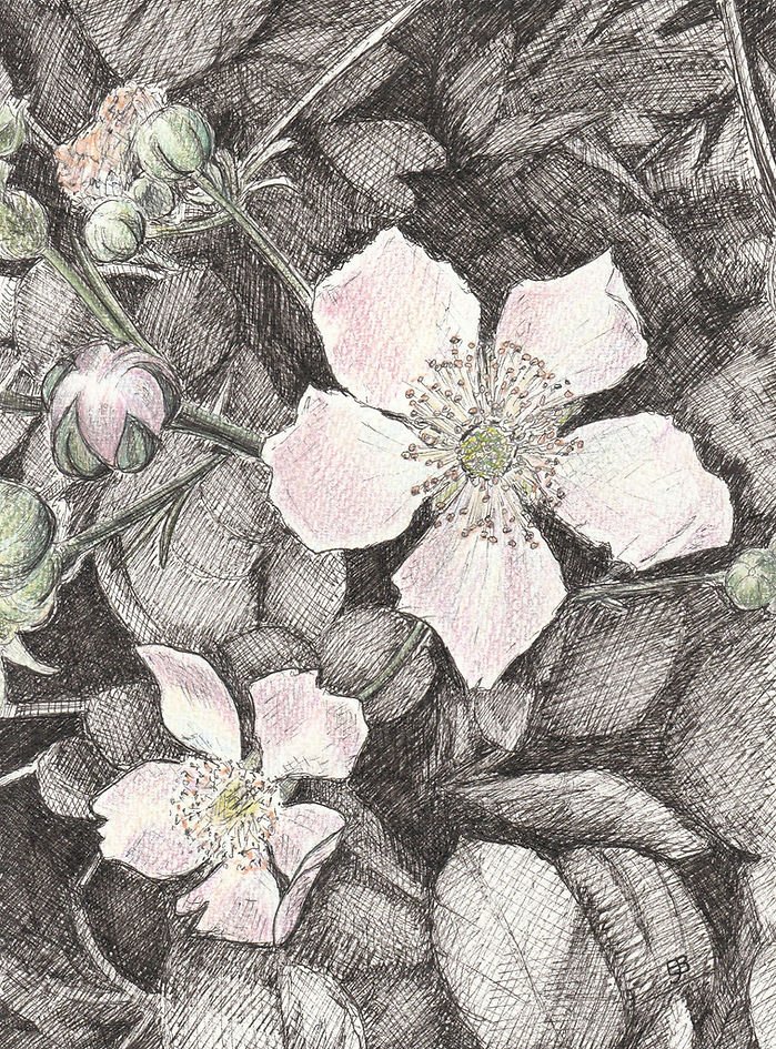
I was really surprised how blue the colour of the flower petals were, when viewed through the colour picker. When I added colours to the ink drawing of the bramble below, I added some light cobalt blue over the other colours in the petals and it transformed them to look much more like the petals in the photo. I wouldn’t have thought to do this without the colour picker tool and so this experiment has really helped me to discover something I wouldn’t have otherwise. It’s amazing how doing something a bit differently and experimenting in art is always worth it!
Colour picker and palette creator tools are definitely worth investigating as an artist. Whether you’re designing a website, creating artwork, or developing your brand’s visual identity, these tools are a great way to incorporate real-world inspiration into your projects. They save time, enhance creativity and, as I found, can help to develop your colour knowledge and colour selection skills. I’ll be using them in future to explore photos and learn about colour.
I also have some very exciting news to share! As of next Friday 26th July, I’ll be the artist in residence at Studio Umami in Ramsey. The residency will run until the 1st of September and, although I’ll be concentrating mainly on my bird-based art, there’ll be an area dedicated to art I’ve completed for the Isle of Man Nature Journal. If you’re in Ramsey, please pop in to say hello (Wednesday – Saturday from 10am to 3.30pm). I’ll be giving more information about the residency, along with photos of the IOMNJ area, in next week’s blog post.

Leave a Reply