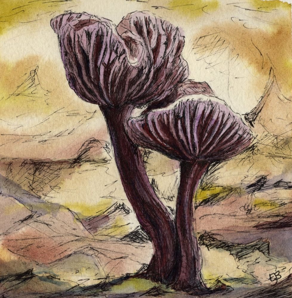
Caput mortuum (Latin for ‘dead head’) is a rich, muted violet-brown pigment with a long and somewhat macabre history. Its name comes from medieval alchemy, where it referred to the useless residue left behind in a retort after a substance had been distilled. This earthy remainder took on symbolic meaning associated with decay, transformation and the cycle of death and rebirth. I’ve recently purchased a tube of Winsor and Newton Caput Mortuum Violet watercolour and tried it out with some mixes and in a sketch with some pleasing results.
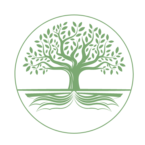
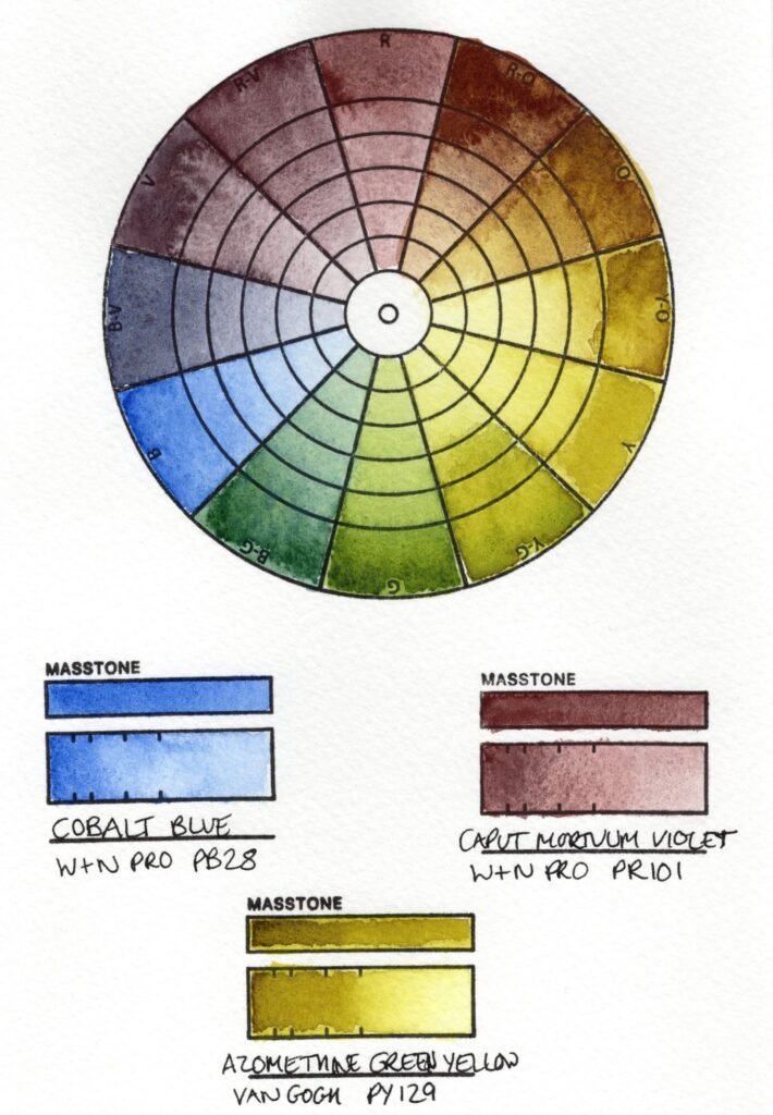
I’ve always loved pink or violet earth colours and often use them in pencil form but not so much in watercolour. On a recent trip to Bridge Bookshop in Ramsey I bought a tube of Winsor and Newton Caput Mortuum Violet and was delighted to see the beautiful, muted-pink tone when I swatched it out back at home. I was intrigued to see how this may work in mixes as I’d love to add it to my next travel palette. I wanted to see how it would mix as a red and as I love using Azomethine Green Yellow (PY129), a Van Gogh watercolour, I decided to create a colour wheel with these pigments as the red and yellow points on the wheel. I couldn’t work out which blue would work best with them though, so I created four colour wheels with a different blue each time.
First, I chose the classic French Ultramarine (PB29) by Winsor and Newton. It’s usually in my palette and I’m pleased with the muted purples this produced with the Caput Mortuum Violet, especially the blueberry-like blue-violet. I’m not so keen on the greens, though, but I don’t think I did the best job of laying down the colour in those sections of the wheel. The Azomethine Green Yellow was repelled by the ink that I used to print the colour wheel, which didn’t help and it took me a little while to find the best way of painting the colours out. I quite like the browns and the dirty lime green mixes that were achieved with the Azomethine Green Yellow and just love the glow this colour gives.
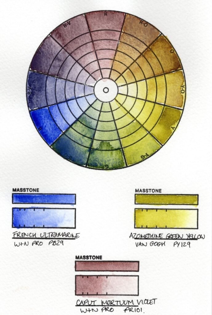
As I always have a version of Payne’s Grey on my palette, I decided to try the Schmincke Payne’s Grey Bluish (PB15:6, PBk6) next. I’m not in love with the purples it made but I do really like the greens and think these would be really useful in painting landscapes. I mixed a richer brown with the Caput Mortuum Violet and Azomethine Green Yellow this time and really like the effect of the whole colour wheel.
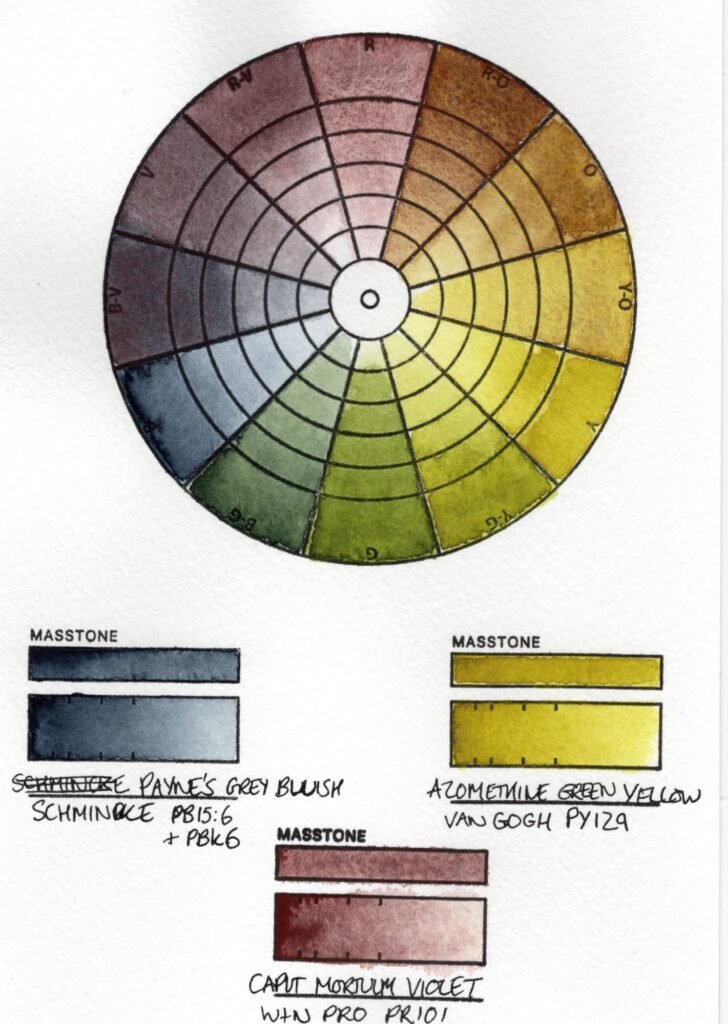
To give completely different mixes, I moved on to Winsor and Newton’s Cerulean Blue (PB35). I like the turquoise and green here and the vibe is certainly more uplifting. The PB35 gave quite an opaque milky effect to the mixes though and I just can’t see me using this combination of pigments very often.
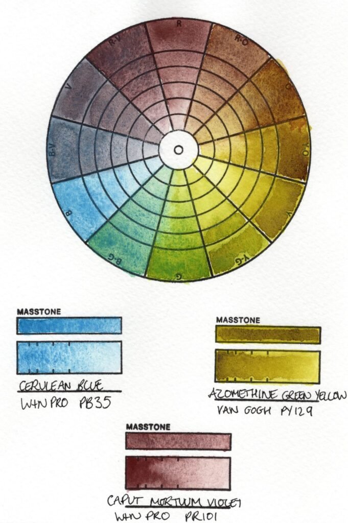
Cobalt blue is often overlooked in my palettes in favour of French Ultramarine, but I love the colour and really wanted to see how the Winsor and Newton version would fare in the wheel. This is my favourite combination as I got useful purples and greens with less granulation than with the French Ultramarine. I can see me adding these colours, along with a Payne’s Grey to my next palette. Peel Castle has lots of these colours in or around it, so I’ll head down to Peel for a sketching session once this palette is up and running.
Historically, caput mortuum was made from natural iron oxide derived from mineral sources, including hematite and other iron-rich earths. In some accounts of dubious accuracy, it was said to be produced from the residue of burned organic matter, even from mummified humans. Such rumours have contributed to the pigment’s eerie reputation, but most high-quality caput mortuum was likely to have come from carefully roasted iron salts, which produced a stable, reddish-violet oxide. The exact hue varied depending on the temperature and impurities present during the firing process. The pigment is now also referred to as Mars Violet, one of a group of synthetic iron oxide pigments including Mars Orange and Mars Red. These are named after the Roman god of war due to his association with iron and are all beautiful earthy colours.
With its association with death, I thought it would be fitting to sketch a type of fungus using Caput Mortuum Violet. I chose the wonderfully named ‘Amethyst Deceiver’ (Laccaria amethystina) as it has a beautiful purple/brown colour and it can be found in woodlands on the Isle of Man (although alas, I’ve never spotted one). Despite its striking appearance, the mushroom is called a ‘deceiver’ because its small size and changing colour can mislead foragers into overlooking or misidentifying it.
Watercolour research is facinating and it’s so relaxing to mix and swatch out the colours. There’s also nothing as lovely as having a local bookshop you can wander into and buy professional grade art supplies, so thank you to Bridge Bookshop for giving us stationery-loving, book-browsing artists a sanctuary on the high street.
I haven’t just been browsing local shops in Ramsey though, I’ve been busy creating and delivering a portrait to the Hodgson-Loom Gallery for the 60 Over 60 Faces of Mann exhibition that opens tomorrow afternoon, with a public preview at 2pm. I’ll be there, along with many other artists, to celebrate the opening of this fantastic exhibition. More information can be found on the Isle Be Creative website or Facebook page.
See you tomorrow if you can make it to Laxey!
Emma
Leave a Reply